|

| ||||||||||
| Create and Manipulate Exciting Text Effects In Illustrator for Import to Photoshop. | |||||||||||
| As my Web grew over the last few months, several things became apparent. One was that it had grown far beyond my initial intent of just putting forth a few of my short stories. Another was that its home page only allowed easy access to some portions of the site, limited access to others, and no direct access to many portions. What was most apparent was that I needed to create a new entry point and a new home page for the site. | |||||||||||
 |
What I came to visualize was a simple, yet attractive new entrance to the site that allowed easy navigation to the whole site. I visualized accomplishing this with a grahic. This vision would eventually require the use of both Photoshop and Illustrator.
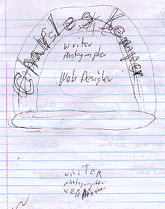
I first thought of the navigation and designed and began work on the button bar, the blue wiener. I realized that the graphic need to accomplish more, that it should tell who I am and what I do. The button bar began to remind me of a stylized old radio. The drawing to the left is my first conceptual sketch of the final graphic (minus the grocery list that was further down the sheet of paper). |
||||||||||
| |||||||||||
| In Illustator, I first drew a circle. Then, with the Type/Path command, I set the type to follow the circle. (The Type Button on the tool bar in illustrator is identical except that if you hold it down you will get some options. The T with the squigly line is the Path Type button. After you have selected this you have merely to click on the shape, whether nit be a crcle, squigle, etc. ang the type will follow the shape. Another nice option is a button that allows you to type inside a shape, the Area Type button.)
I then drew the larger and smaller circles that made the outlines of the arc, and erased the first cirlcle. After changing the the type to an outline, I began on the inner type. Once this type was set and positioned, I use the Type/Create Outlines menu commands. This sepatates all the characters in a selection so that each character can be worked on or repositioned independently. I then worked on each letter individually, using the Filter/Distort/Free Distort commands to distort them to their present shape. (You can also use this feature if you want to create perspective to your type. If you have Adobe Domensions included with your Illustror, you can even create 3D type!) I then grouped (Arrange/Group will group any selected text and other shapes) the whole mess and gave it a tug on the top to distort the whole image. This is the image that I then imported to Photoshop. |  A letter being distorted in the Free Distort dialog box.  |
||||||||||
| [Note: While you can save the image in Illustrator as a Photoshop file and it will be automatically rasterized, you are better off to save it as an Illustrator file. Photoshop will automatically rasterize it when you open it, but if you keep the file as an Illustrator is easier to go an rework the vector form (which sees shapes instead of individual pixels) if neccessary. However, the two programs are so well mated that you can simply drag and drop your Illustrator image into a Photoshop window, in which case I would still save a version in Illustrator. Whichever method of import you choose, a dialog box will appear to aid you in the conversion.] | |||||||||||
| |||||||||||
| |||||||||||
| My conclusion is that if you want more versatility, better quality, and finer control with type than is afforded with Photoshop, go to Illustrator. The two programs compliment each other well. | |||||||||||


